The ROI of UX DesignHow Interface Changes Increased Conversion
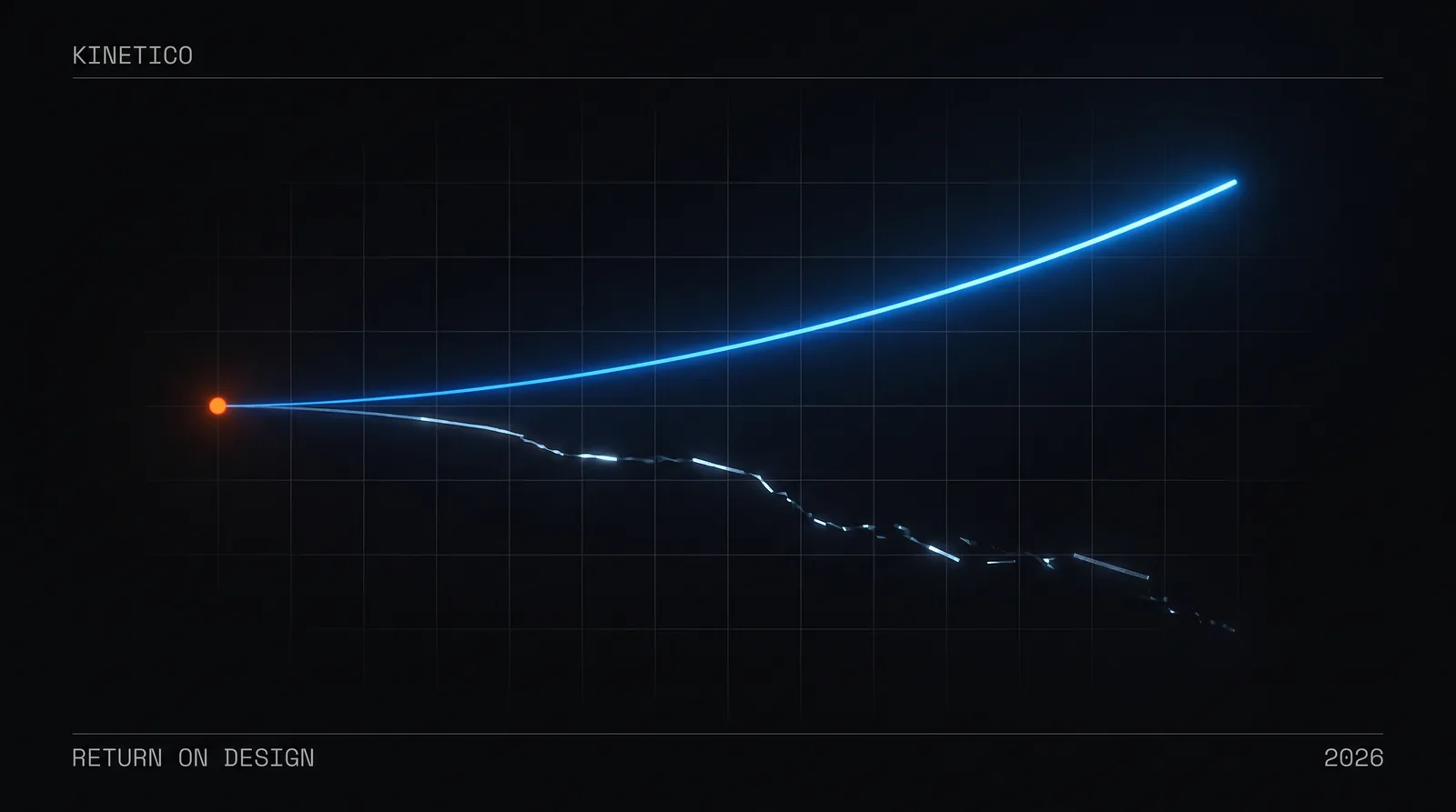
The ROI of good design isn't a creative luxury—it's a measurable business multiplier. McKinsey's Design Index tracked 300 public companies and found the top design performers grew revenue 32 percentage points faster than their peers over five years. Yet many organizations still treat design as decoration, not strategy.
Key Takeaways
- •Design is a measurable business multiplier, not just aesthetics.
- •Design leaders grow revenue ~32 points faster than peers over five years (McKinsey Design Index).
- •Personalised CTA copy converts 202% better than generic (HubSpot, 330,000-CTA analysis).
- •Users judge credibility in 50 milliseconds based on design quality.
Turning that argument into scope and a price is our product design service. The friction economy makes the same case by subtraction rather than by revenue.
The Cheapest Conversion Bug Is Usually a Design Bug
Here is a failure pattern worth checking for on your own product, because it is common, it is invisible in analytics, and it costs nothing to fix.
Traffic is healthy—organic, paid, referral. Visitors land on the product page, scroll, hover over the images, read the description. Then they leave. Not a bounce: they were engaged. Session recordings show the cursor drifting toward the primary action and stopping short.
Often the button is simply the wrong shade of the brand colour.
Not dramatically wrong. It matches the palette perfectly. But it shares a hue with the informational links around it, so visually it whispers where it needs to command, and the brain files it under "navigation" rather than "action." The fix is one CSS property. The diagnosis is the hard part, because nothing in the funnel report says "your call to action does not read as a call to action."
We are deliberately not attaching a lift number to that. Published tests on call-to-action treatment are cited further down this page—HubSpot's 330,000-CTA analysis is the largest of them—and they are a far better guide to the size of the effect than any single anecdote, including ours. The point of the pattern is the diagnosis, not the percentage.
If you've ever stared at your own metrics wondering why users aren't converting, you've experienced this. The uncomfortable truth: your design might be the silent saboteur.
Why Does Design Impact Business Results? (The Psychology)
The button story isn't magic—it's neuroscience. Design decisions trigger cognitive and emotional responses that directly influence behavior. This isn't opinion; it's documented, measurable, and reproducible.
What Is the Psychology Behind Design-Driven Conversion?
Your brain processes visual information in approximately 13 milliseconds—faster than conscious thought. In that instant, your visual cortex makes judgments: safe or threatening, familiar or strange, trustworthy or suspicious.
Design is the language of these snap judgments. Consider what happens when a user lands on your page:
- Visual hierarchy tells their eyes where to look first, second, third—guiding them toward action
- Color psychology triggers emotional associations (blue = trust, orange = urgency, green = go)
- Cognitive load determines whether they feel clarity or confusion—and confusion kills conversion
- Micro-friction accumulates invisibly—each small annoyance compounds until users abandon
Research from Stanford's Web Credibility Project found that nearly half of users (46%) judge a company's credibility based on visual design alone. Not content. Not price. The visual experience forms the foundation of trust.
How Much Do Small Design Changes Actually Impact Conversion?
The data is striking. Here are documented cases of minimal design interventions producing disproportionate business results:
- Personalizing CTA copy to the visitor's journey stage converts 202% better than generic CTAs (HubSpot, 330,000-CTA analysis)
- Reducing form fields from 11 to 4 increased conversion by 120% (Imagescape test)
- Adding white space around content improved comprehension by 20% and user satisfaction by 25% (Wichita State research)
- Improving page load time by 100ms increased Walmart's revenue by 1%—millions of dollars annually
These aren't edge cases. This is how humans interface with digital experiences. Every design decision either creates friction or removes it, builds trust or erodes it, guides action or allows drift.
The question isn't whether design impacts business outcomes. It's whether you're intentionally optimizing that impact or leaving money on the table.
The Conversion Design Framework: Where ROI Lives
At Kinetico, we approach design ROI through a structured lens. Not every pixel matters equally—but certain design elements are disproportionately responsible for business outcomes.
Element 1: Friction Mapping
Friction is the enemy of conversion. It exists everywhere: confusing navigation, slow loading states, unclear calls to action, walls of text, ambiguous microcopy. Each friction point is a leak in your conversion funnel.
The principle: Map every step of your user journey and identify moments of hesitation, confusion, or abandonment. Prioritize friction reduction by impact and effort—quick wins first.
We use session recordings extensively. Watching real users interact with interfaces reveals friction that analytics alone cannot. Where do cursors hesitate? Where do users scroll back up? Where do they randomly click, hunting for what should be obvious?
Element 2: The Trust Stack
Users need to trust you before they convert. Trust isn't built through claims—it's demonstrated through design signals:
- Visual polish: Refined aesthetics signal competence and care. If you can't get design right, what else are you getting wrong?
- Social proof: Testimonials, logos, reviews— positioned where doubt naturally arises
- Authority indicators: Professional photography, consistent brand language, clear contact information
- Safety signals: Secure checkout badges, money-back guarantees, privacy assurances—visible at decision points
The insight: Trust elements aren't decoration. They're conversion architecture. Position them strategically at moments of doubt in the user journey.
Element 3: Action Clarity
Users should never wonder: "What do I do next?"
Yet this basic principle is violated constantly. Pages with competing calls to action, buttons that blend into backgrounds, next steps buried below the fold. Every moment of confusion is a conversion opportunity lost.
The 3-second rule: A new visitor should understand the primary action they can take within 3 seconds of landing. If they can't, your visual hierarchy needs work.
Contrast matters. Size matters. Position matters. The primary CTA should be visually unmissable—color-contrasted, generously sized, and positioned where eyes naturally land.
Element 4: Momentum Through Motion
Static interfaces feel dead. Subtle motion creates the perception of responsiveness, progress, and life. At Kinetico, we call this the 700ms principle—transitions long enough for cognitive processing, short enough to feel snappy.
Loading states, hover effects, transition animations—these aren't polish. They're psychological comfort. Users feel reassured when interfaces respond to their actions. Micro-interactions confirm: "Yes, that worked."
The Kinetico Approach: Design as Strategic Investment
At Kinetico, we don't view design as an aesthetic exercise— we treat it as strategic engineering for business outcomes. Every interface decision we make is filtered through the lens of user psychology and business impact.
This philosophy emerges from our belief that impactful design happens at the intersection of logic and emotion. We're not just making things pretty. We're engineering experiences that guide users toward action while making them feel confident, understood, and empowered.
Checkout is where that shows up most plainly. Baymard Institute's running average of documented studies puts cart abandonment at roughly 70%, which means most teams look at their own number, conclude they are "normal," and stop investigating. Normal is not the same as optimised.
These are the friction points a checkout audit turns up most often:
- Guest checkout was available but visually de-emphasized—most users assumed they had to create an account
- The progress indicator disappeared on mobile, creating uncertainty about how many steps remained
- Error messages used technical language that confused rather than guided
- Trust badges were positioned at the top of the page—invisible when users needed reassurance at the payment step
The corresponding moves are unglamorous and well understood. Guest checkout becomes the default, prominently labelled "Quick Checkout." A persistent progress bar shows exactly where users stand. Error messages become conversational: "That card number doesn't look quite right—check for typos?" Security badges sit adjacent to the payment form, where anxiety actually peaks, rather than at the top of the page where nobody is worried yet.
None of that is clever. It is the difference between a checkout designed around the database and one designed around the person paying, and it is the kind of work that has a defensible business case attached before it starts—which is the whole argument of this page. Instrument the funnel first, fix the friction, and the improvement is attributable rather than asserted.
How to Improve Design ROI: Practical Takeaways
Whether you're auditing your own product or making the business case for design investment, here are actionable principles to apply:
1. Measure Before You Move
You can't prove ROI without baseline metrics. Before any design initiative, document current conversion rates, engagement metrics, and revenue figures. What gets measured gets optimized.
2. Watch Real Users (Literally)
Install session recording tools like Hotjar or FullStory. Watch actual user behavior—not what you assume they do. Friction you never noticed will become painfully obvious.
3. Prioritize High-Impact Pages
Not all pages matter equally. Focus design energy on conversion points: landing pages, product pages, checkout flows, signup forms. A 10% improvement on your checkout page matters more than a 50% improvement on your "About" page.
4. Test Relentlessly, But Intelligently
A/B testing isn't optional—it's how hypotheses become proof. But test meaningful variations. Changing button color is worth testing; changing a shade of gray isn't. Focus tests on elements that influence trust, clarity, and action.
5. Design for Mobile Reality
Mobile traffic often exceeds 60%. If your mobile experience is a responsive afterthought, you're optimizing for the minority. Thumb-friendly CTAs, legible text without zooming, minimal form fields—mobile-first isn't a buzzword, it's arithmetic.
6. Speed Is a Design Decision
Every additional second of load time costs conversions—studies consistently show 7%+ drop per second of delay. Performance isn't a technical concern separate from design; it's a core design metric.
7. Build a Design System
Consistency compounds. A design system ensures every touchpoint reinforces trust and reduces cognitive load. It also dramatically improves design efficiency—the ROI of design investment extends to development velocity too.
Beyond Aesthetics: Design as Business Strategy
The most expensive design is the design you never invested in. The checkout flow that bleeds conversions. The landing page that confuses rather than converts. The mobile experience that frustrates your most valuable visitors into leaving.
Every day you operate with suboptimal design, you're paying a tax—an invisible tax of lost conversions, eroded trust, and missed opportunities. That tax compounds.
Design isn't a cost center. It's a profit lever. The businesses that understand this treat UX investment like any other strategic initiative: measured, optimized, and held accountable to business outcomes.
What would a 2x improvement in your conversion rate mean for your business? That number is within reach. It lives in the details—the button colors, the microcopy, the loading states, the friction you've learned to overlook. It lives in design.
At Kinetico, we help organizations unlock the business value hidden in their interfaces. Not through guesswork or aesthetic preference—through systematic, psychology-informed design that moves metrics.
The next time you look at your conversion rates, ask yourself: is this a traffic problem, or a design problem? The answer might be worth millions.
Good design pays dividends. Great design multiplies them.
Ready to turn your interface into a conversion engine? Our product design service is design done by the people who build it — every state, a coded design system, one fixed price.
Who wrote this, and where the claims come from
Written by Pukar Khanal and the Kinetico team, a product design and engineering studio in Pokhara, Nepal. Every number on this page is quoted from a published third-party study and linked to its source — McKinsey's Design Index, Stanford's Web Credibility Project, HubSpot's CTA analysis, Baymard Institute and Walmart's performance data. None of them are measurements of a Kinetico engagement, and no client is described. This page was revised on 2026-08-29 to remove two illustrative case studies that read as though they were ours. Our published work is on the work page, and our scope and prices are on the pricing page.
Published 2025-11-05 · Last reviewed 2026-08-29 · Author: Pukar Khanal, Kinetico
Related articles
User Friction in UX: When to Remove It, When to Keep It
User friction in UX, explained: when to slow people down, where to remove choices, and why the most powerful UX decision is often doing less. Practical frameworks for product teams.
How to Choose a Software Development Company: 7 Criteria Founders Use
How to choose a software development company or partner: the 7 criteria that separate teams who ship from teams who delay, with the evaluation questions to ask and the red flags to walk away from.
How Much Does It Cost to Build an MVP in 2026? Real Numbers by Scope
MVP development cost in 2026: $15k–$50k over 6–12 weeks with a design-and-engineering studio — by scope tier, product type, phase and region, with a week-by-week timeline and the estimation model behind the numbers.